# Load the tidyverse package below
library(tidyverse)

# Load the data file
# This should be the Zhang_2014.csv file
zhang_data <- read_csv("data/Zhang_2014.csv")

# Wrangle the data for plotting.
# select and rename key variables
# mutate to add participant ID and recode
zhang_data <- zhang_data %>%
  select(Gender,
         Age,
         Condition,
         time1_interest = T1_Predicted_Interest_Composite,
         time2_interest = T2_Actual_Interest_Composite) %>%
  mutate(participant_ID = row_number(),
         Condition = case_match(Condition,
                            1 ~ "Ordinary",
                            2 ~ "Extraordinary"),
         Gender = case_match(Gender,
                             1 ~ "Male",
2 ~ "Female")) 7 Scatterplots, boxplots, and violin-boxplots
Back in Chapter 3, we introduced you to data visualisation in R/RStudio using the package
In this chapter, we develop your data visualisation skills to cover scatterplots, boxplots, and violin-boxplots. This will give you the skills to visualise your data in the next few chapters on inferential statistics. This is the final data visualisation specific chapter in the book, but by learning these core concepts, you will be able to find out how to create additional types of data visualisation independently.
Chapter Intended Learning Outcomes (ILOs)
By the end of this chapter, you will be able to:
Create and edit a scatterplot to visualise the relationship between two continuous variables.
Create and edit a boxplot to visualise summary statistics for a continuous outcome.
Create and edit a violin-boxplot to visualise the density of data points in a continuous outcome.
Customise your plots to include colourblind-friendly colour palettes and facet your data to visualise multiple independent variables.
7.1 Chapter preparation
7.1.1 Introduction to the data set
For this chapter, we are using open data from Zhang et al. (2014). The abstract of their article is:
Although documenting everyday activities may seem trivial, four studies reveal that creating records of the present generates unexpected benefits by allowing future rediscoveries. In Study 1, we used a time-capsule paradigm to show that individuals underestimate the extent to which rediscovering experiences from the past will be curiosity provoking and interesting in the future. In Studies 2 and 3, we found that people are particularly likely to underestimate the pleasure of rediscovering ordinary, mundane experiences, as opposed to extraordinary experiences. Finally, Study 4 demonstrates that underestimating the pleasure of rediscovery leads to time-inconsistent choices: Individuals forgo opportunities to document the present but then prefer rediscovering those moments in the future to engaging in an alternative fun activity. Underestimating the value of rediscovery is linked to people’s erroneous faith in their memory of everyday events. By documenting the present, people provide themselves with the opportunity to rediscover mundane moments that may otherwise have been forgotten.
In summary, they were interested in whether people could predict how interested they would be in rediscovering past experiences. They call it a “time capsule” effect, where people store photos or messages to remind themselves of past events in the future.
At the start of the study (time 1), participants in a romantic relationship wrote about two kinds of experiences. An “extraordinary” experience with their partner on Valentine’s day and an “ordinary” experience one week before. They were then asked how enjoyable, interesting, and meaningful they predict they will find these recollections in three months time (time 2). Three months later, Zhang et al. randomised participants into one of two groups. In the “extraordinary” group, they reread the extraordinary recollection. In the “ordinary” group, they reread the ordinary recollection. All the participants completed measures on how enjoyable, interesting, and meaningful they found the experience, but this time what they actually felt, rather than what they predict they will feel.
They predicted participants in the ordinary group would underestimate their future feelings (i.e., there would be a bigger difference between time 1 and time 2 measures) compared to participants in the extraordinary group. In this chapter, we focus on a composite measure which took the mean of items on interest, meaningfulness, and enjoyment.
7.1.2 Organising your files and project for the chapter
Before we can get started, you need to organise your files and project for the chapter, so your working directory is in order.
In your folder for research methods and the book
ResearchMethods1_2/Quant_Fundamentals, create a new folder calledChapter_07_dataviz. WithinChapter_07_dataviz, create two new folders calleddataandfigures.Create an R Project for
Chapter_07_datavizas an existing directory for your chapter folder. This should now be your working directory.Create a new R Markdown document and give it a sensible title describing the chapter, such as
07 Scatterplots Boxplots Violins. Delete everything below line 10 so you have a blank file to work with and save the file in yourChapter_07_datavizfolder.We are working with a new data set, so please save the following data file: Zhang_2014.csv. Right click the link and select “save link as”, or clicking the link will save the files to your Downloads. Make sure that you save the file as “.csv”. Save or copy the file to your
data/folder withinChapter_07_dataviz.
You are now ready to start working on the chapter!
7.1.3 Activity 1 - Read and wrangle the data
As the first activity, try and test yourself by completing the following task list to practice your data wrangling skills. Create an object called zhang_data to be consistent with the tasks below. If you want to focus on data visualisation, then you can just type the code in the solution.
Try this
To wrangle the data, complete the following tasks:
Load the
tidyverse package.Read the data file
data/Zhang_2014.csv.-
Select the following columns:
GenderAgeConditionT1_Predicted_Interest_Compositerenamed totime1_interestT2_Actual_Interest_Compositerenamed totime2_interest.
There is currently no identifier, so create a new variable called
participant_ID. Hint: tryparticipant_ID = row_number().-
Recode two variables to be easier to understand and visualise:
Gender: 1 = “Male”, 2 = “Female”.
Condition: 1 = “Ordinary”, 2 = “Extraordinary”.
Your data should now be in wide format and ready to create a scatterplot.
Show me the solution
You should have the following in a code chunk:
7.1.4 Activity 2 - Explore the data
Try this
After the wrangling steps, try and explore zhang_data to see what variables you are working with. For example, opening the data object as a tab to scroll around, explore with glimpse(), or try plotting some of the individual variables to see what they look like using visualisation skills from Chapter 3.
In zhang_data, we have the following variables:
| Variable | Type | Description |
|---|---|---|
| Gender | character | Participant gender: Male (1) or Female (2) |
| Age | double | Participant age in years. |
| Condition | character | Condition participant was randomly allocated into: Ordinary (1) or Extraordinary (2). |
| time1_interest | double | How interested they predict they will find the recollection on a 1 (not at all) to 7 (extremely) scale. This measure is the mean of enjoyment, interest, and meaningfulness. |
| time2_interest | double | How interested they actually found the recollection on a 1 (not at all) to 7 (extremely) scale. This measure is the mean of enjoyment, interest, and meaningfulness. |
| participant_ID | integer | Our new participant ID as an integer from 1 to 130. |
We will use this data set to demonstrate different ways of visualising continuous variables, either combining multiple continuous variables in a scatterplot or splitting continuous variables into categories in a boxplot or violin-boxplot.
7.2 Scatterplots
The first visualisation is a scatterplot to show the relationship between two continuous variables. One variable goes on the x-axis and the other variables goes on the y-axis. Each dot then represents the intersection of those two variables per observation/participant. You will use these plots often when reporting a correlation or regression.
7.2.1 Activity 3 - Creating a basic scatterplot
Let us start by making a scatterplot of Age and time1_interest to see if there is any relationship between the two. We need to specify both the x- and y-axis variables, but the only difference to what we created in Chapter 3 is using a new layer geom_point.
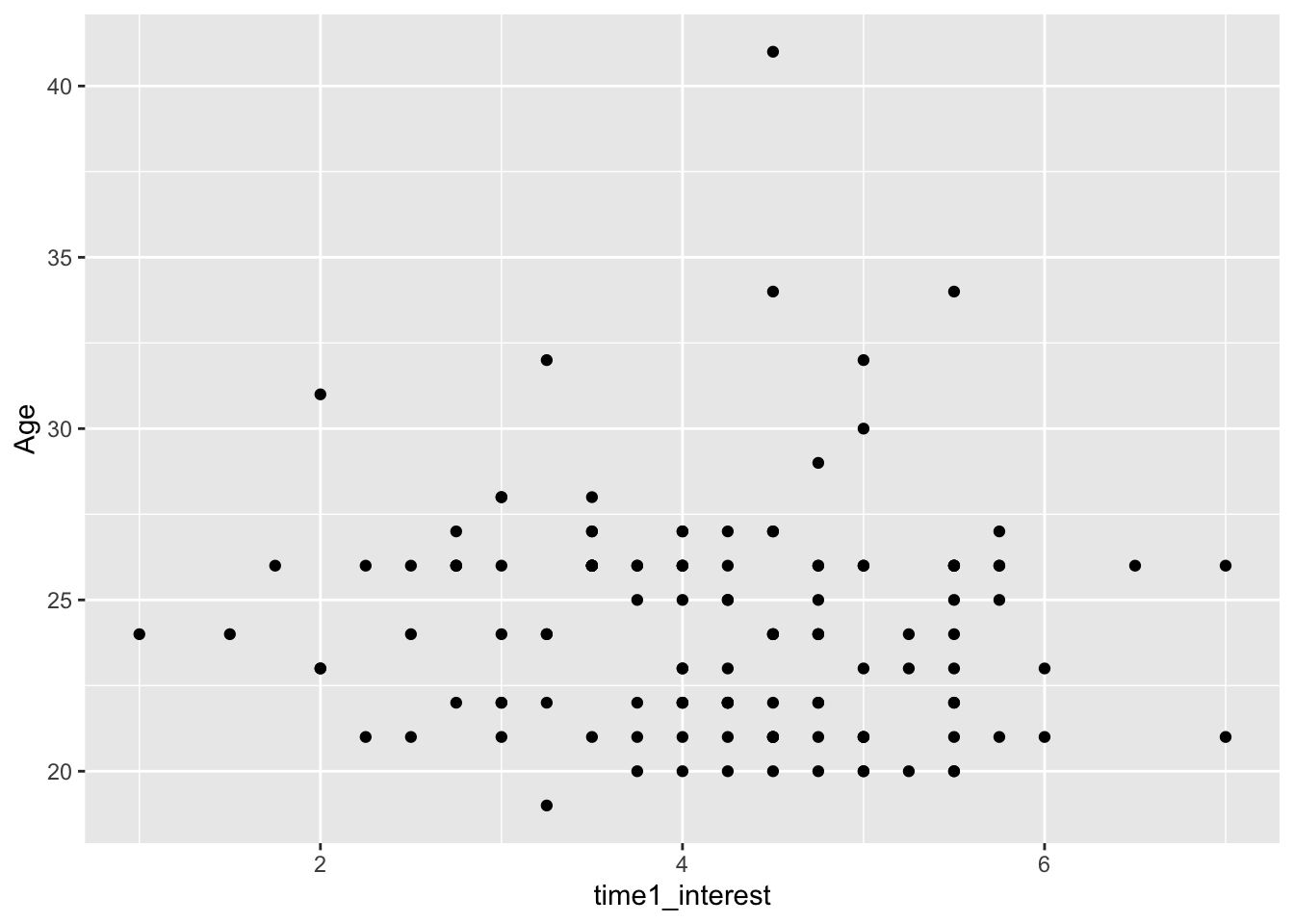
7.2.2 Activity 4 - Editing axis labels
This plot is great for some exploratory data analysis, but it looks a little untidy to put into a report. We can use the scale_x_continuous and scale_y_continuous layers to control the tick marks, as well as the axis name.
zhang_data %>%
  ggplot(aes(x = time1_interest,y = Age)) +
  geom_point() +
  scale_x_continuous(name = "Time 1 interest score (1-7)",
                     breaks = c(1:7)) + # tick marks from 1 to 7
  scale_y_continuous(name = "Age",
                     limits = c(15, 45), # change limits to 15 to 45
                     breaks = seq(from = 15, # sequence from 15
                                  to = 45, # to 45
                                  by = 5)) # in steps of 5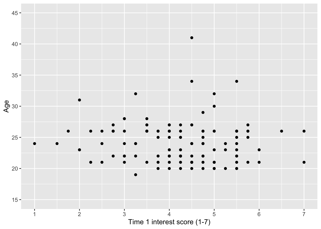
To break down these new arguments/functions in the layers:
breaksset the tick marks on the plot. We demonstrate two ways of setting this. On the x-axis, we just manually set values for 1 to 7. On the y-axis, we use a second function to set the breaks.seq()creates a sequence of numbers and can save a lot of time when you need to add lots of values. We set three arguments,fromfor the starting point,tofor the end point, andbyfor the steps the sequence goes up in.limitscontrols the start and end point of the graph scale. In the original graph, we can see there are points below 20 and above 40, so we might want to increase thelimitsof the graph to include a wider range.
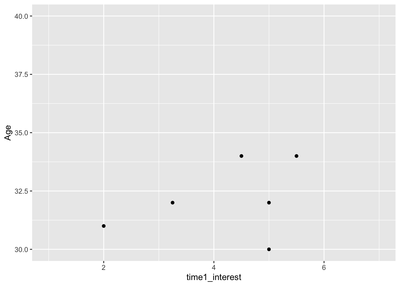
Error mode
When controlling the limits of the graph, sometimes you want to decrease the limits range to zoom in on an element of the data. If you decrease the range which cuts off some data points, you must be very careful as it actually cuts off data which you would receive a warning about:
zhang_data %>%
  ggplot(aes(x = time1_interest,y = Age)) +
  geom_point() +
  scale_y_continuous(name = "Age",
                     limits = c(30, 40)) # in steps of 5
Warning: Removed 124 rows containing missing values (`geom_point()`).
You must be very careful when truncating axes, but if you do need to do it, there is a different function layer to use:
7.2.3 Activity 5 - Adding a regression line
It is often useful to add a regression line or line of best fit to a scatterplot. You can add a regression line with the geom_smooth() layer and by default will also provide a 95% confidence interval ribbon. You can specify what type of line you want to draw, most often you will need method = "lm" for a linear model or a straight line.
zhang_data %>%
  ggplot(aes(x = time1_interest,y = Age)) +
  geom_point() +
  scale_x_continuous(name = "Time 1 interest score (1-7)",
                     breaks = c(1:7)) + # tick marks from 1 to 7
  scale_y_continuous(name = "Age",
                     limits = c(15, 45), # change limits to 15 to 45
                     breaks = seq(from = 15, # sequence from 15
                                  to = 45, # to 45
                                  by = 5)) +  # in steps of 5
  geom_smooth(method = "lm")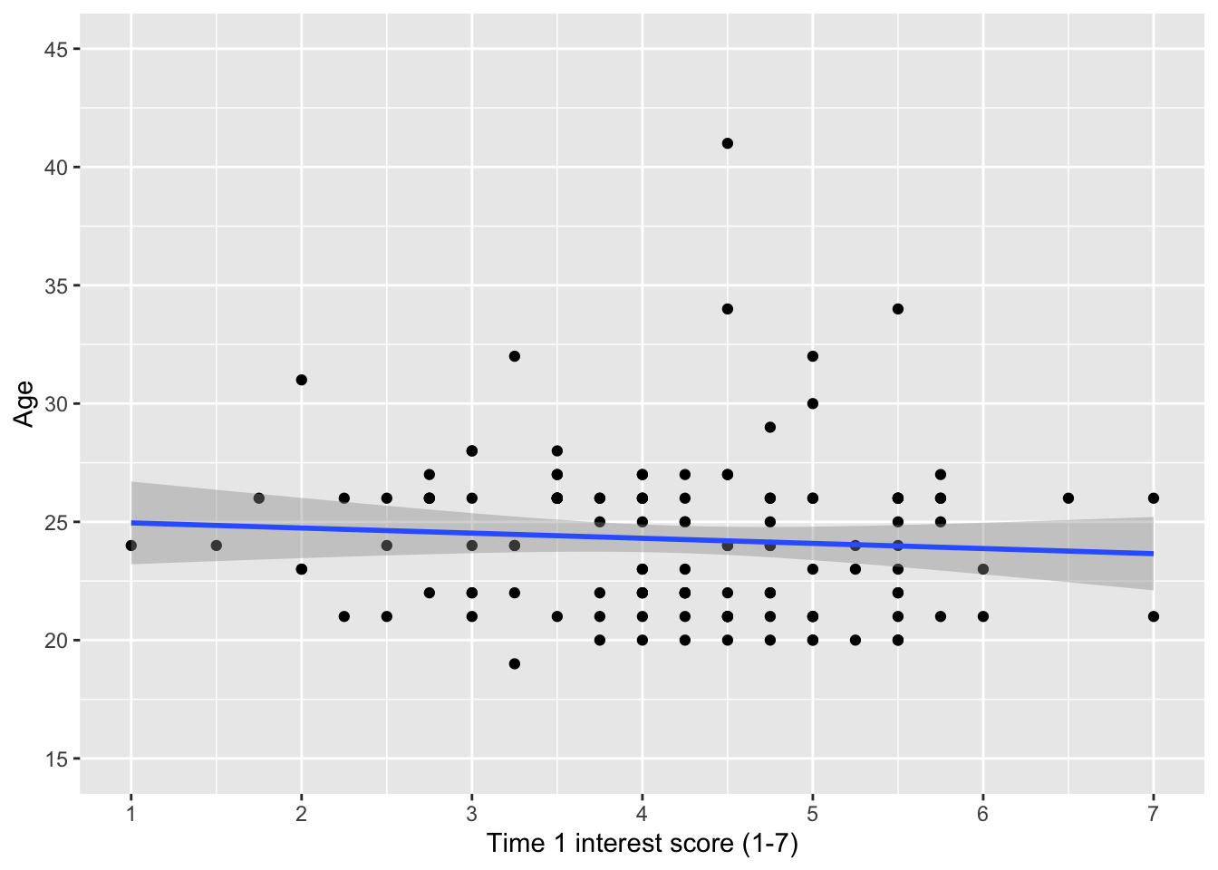
With the regression line, we can see there is very little relationship between age and interest score at time 1.
Important
Remember, you can save your plots using the function ggsave(). You can use the function after creating the last plot, or saving your plot as an object and using the plot argument. You have a Figures/ directory for the chapter, so try and save the plots you make to remind yourself later.
Try this
So far, we made a scatterplot of age against interest at time 1. Now, create a scatterplot on your own using the two interest rating variables: time1_interest and time2_interest.
After you made the scatterplot, it looks like there is a relationship between interest ratings at time 1 and time 2.
Show me the solution
You should have the following in a code chunk:
zhang_data %>%
  ggplot(aes(x = time1_interest, y = time2_interest)) +
  geom_point() +
  scale_x_continuous(name = "Time 1 interest score (1-7)",
                     breaks = c(1:7)) + # tick marks from 1 to 7
  scale_y_continuous(name = "Time 2 interest score (1-7)",
                     breaks = c(1:7)) + # tick marks from 1 to 7
  geom_smooth(method = "lm")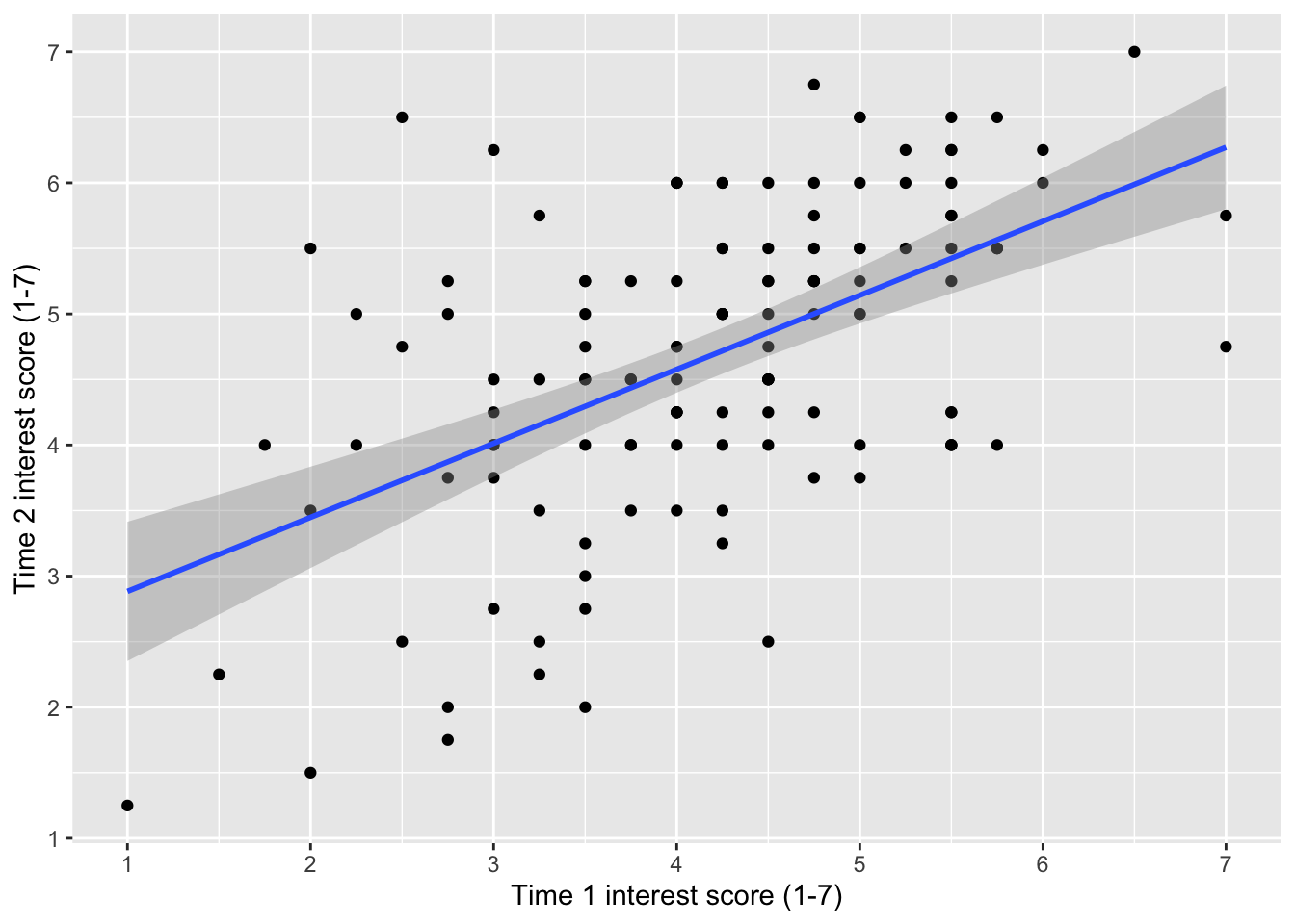
7.2.4 Activity 6 - Creating a grouped scatterplot
Before we move on, we can add a third variable to show how the relationship might differ for different groups within our data. We can do this by adding the colour argument to aes() and setting it as whatever variable we would like to distinguish between. In this case, we will see how the relationship between age and interest at time 1 differs for the male and female participants. There are a few participants with missing gender, so we will first filter them out.
zhang_data %>%
  drop_na(Gender) %>%
  ggplot(aes(x = time1_interest, y = Age, colour = Gender)) +
  geom_point() +
  scale_x_continuous(name = "Mean interest score (1-7)",
                     breaks = c(1:7)) +
  scale_y_continuous(name = "Age") +
  geom_smooth(method = "lm")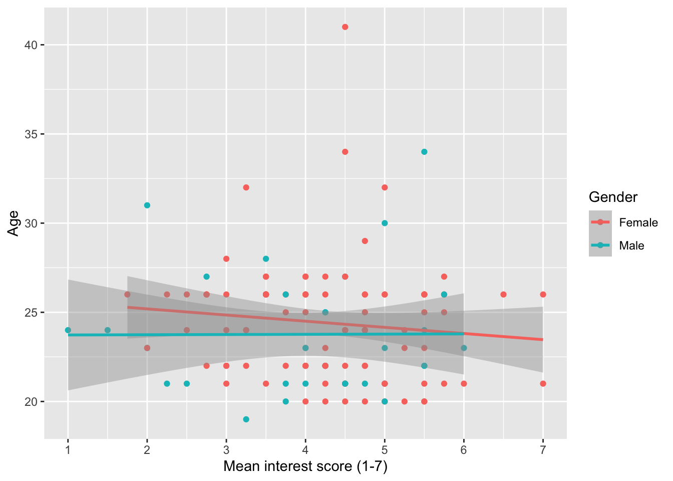
Try this
For your independent scatterplot of the two interest rating variables: time1_interest and time2_interest, add a colour argument using the Condition variable. This will show the relationship between time 1 and time 2 interest separately for participants in the ordinary and extraordinary groups.
Show me the solution
You should have the following in a code chunk:
zhang_data %>%
  ggplot(aes(x = time1_interest, y = time2_interest, colour = Condition)) +
  geom_point() +
  scale_x_continuous(name = "Time 1 interest score (1-7)",
                     breaks = c(1:7)) + # tick marks from 1 to 7
  scale_y_continuous(name = "Time 2 interest score (1-7)",
                     breaks = c(1:7)) + # tick marks from 1 to 7
  geom_smooth(method = "lm")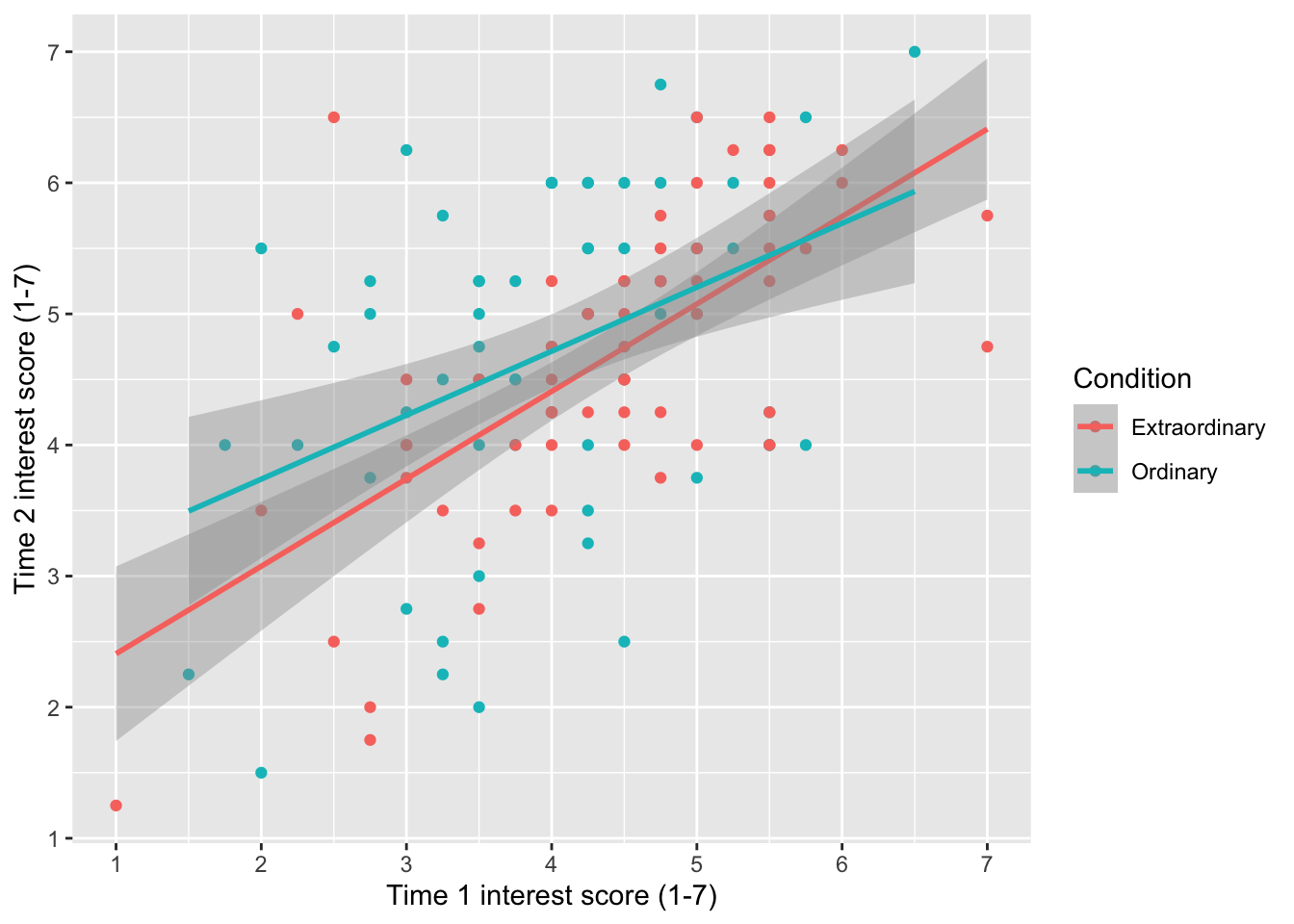
7.3 Boxplots
The next visualisation is the boxplot which presents a range of summary statistics for your outcome, which you can split between different groups on the x-axis, or add further variables to divide by. For the boxplot element, you get five summary statistics: the median centre line, the first and third quartile as the box (essentially, the interquartile range), and 1.5 times the first and third quartiles as the whiskers extending from the box. If there are any values beyond the whiskers, you see the individual data points and this is one definition of an outlier (more on that in Chapter 11)
7.3.1 Activity 7 - Creating a basic boxplot
Before we create the boxplot, we need a final data wrangling step. At the moment, we have time1_interest and time2_interest in wide format, but to plot together, we need to express it as a single variable. For that, we must restructure the data. This is why we spent so much time on data wrangling, as you might need to quickly restructure your data to plot certain elements.
Try this
To wrangle the data, gather the variables time1_interest and time2_interest. Create a new object called zhang_data_long and use the names Time and Interest for your column names to be consistent with the demonstrations below.
Show me the solution
If you only want to visualise one continuous variable, we need one variable on the y-axis and a new function layer geom_boxplot().
zhang_data_long %>%
ggplot(aes(y = Interest)) +
geom_boxplot() +
scale_y_continuous(name = "Interest score (1-7)",
breaks = c(1:7))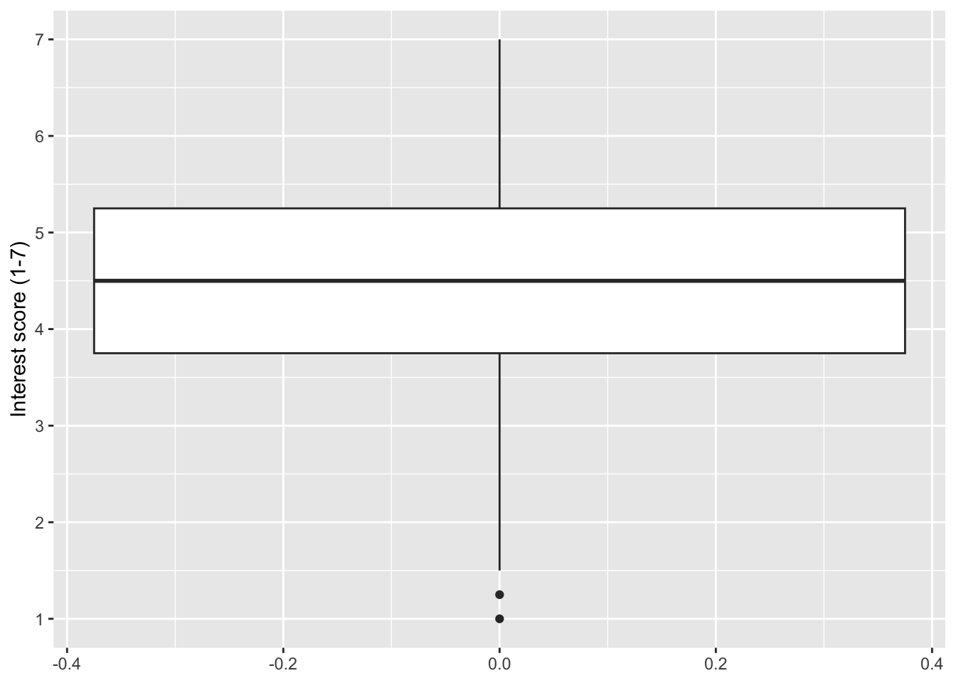
Typically, you want to compare the outcome between one or more categories, so we can add a categorical variable like gender to the x-axis, removing the missing values first.
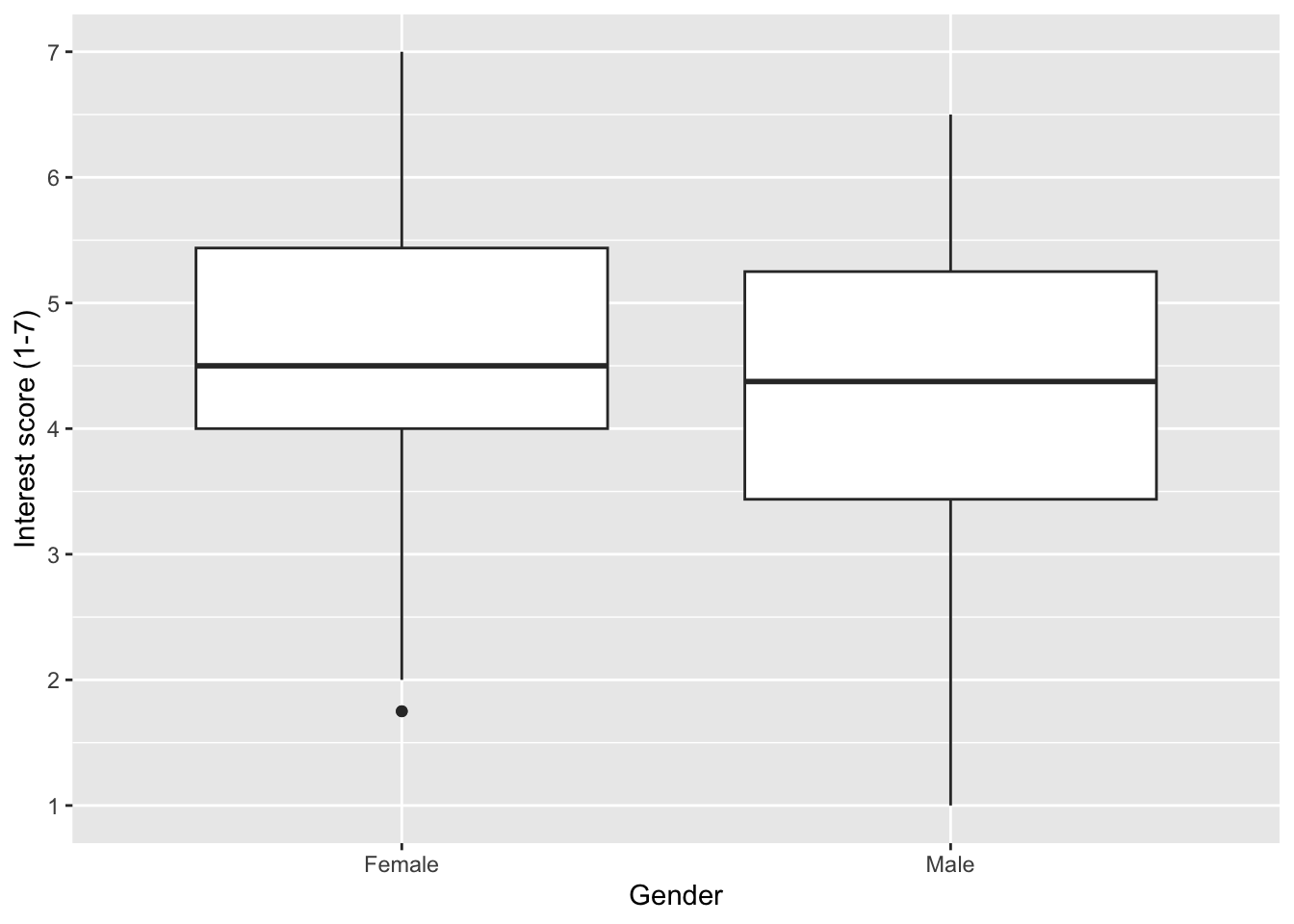
7.3.2 Activity 8 - Adding colour to variables
It is not as important when you only have one variable on the x-axis, but one useful feature is adding colour to distinguish between categories. You can control this by adding a variable to the fill argument within aes().
By default, we get a legend which is redundant when we only have different colours on the x-axis, so we can turn it off by adding guides(fill = FALSE) as a layer.
zhang_data_long %>%
drop_na(Gender) %>%
ggplot(aes(y = Interest, x = Gender, fill = Gender)) +
geom_boxplot() +
scale_y_continuous(name = "Interest score (1-7)",
breaks = c(1:7)) +
guides(fill = FALSE) # remove the legend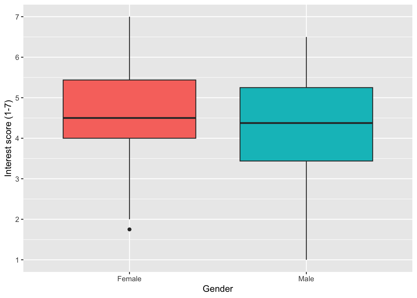
Error mode
You might have noticed we have now used two different arguments to control the colour. In scatterplots, we used colour. In boxplots, we used fill. It is one of those concepts that takes time to recognise which you need, depending on the type of geom you are using. Roughly, colour is when you want to control the outline or symbol, like the points. Whereas fill is when you want the inside of a geom coloured. You can see the difference here by controlling fill first:
zhang_data_long %>%
drop_na(Gender) %>%
ggplot(aes(y = Interest, x = Gender, fill = Gender)) +
geom_boxplot() +
scale_y_continuous(name = "Interest score (1-7)",
breaks = c(1:7))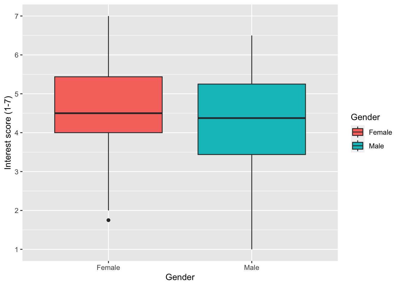
Then colour:
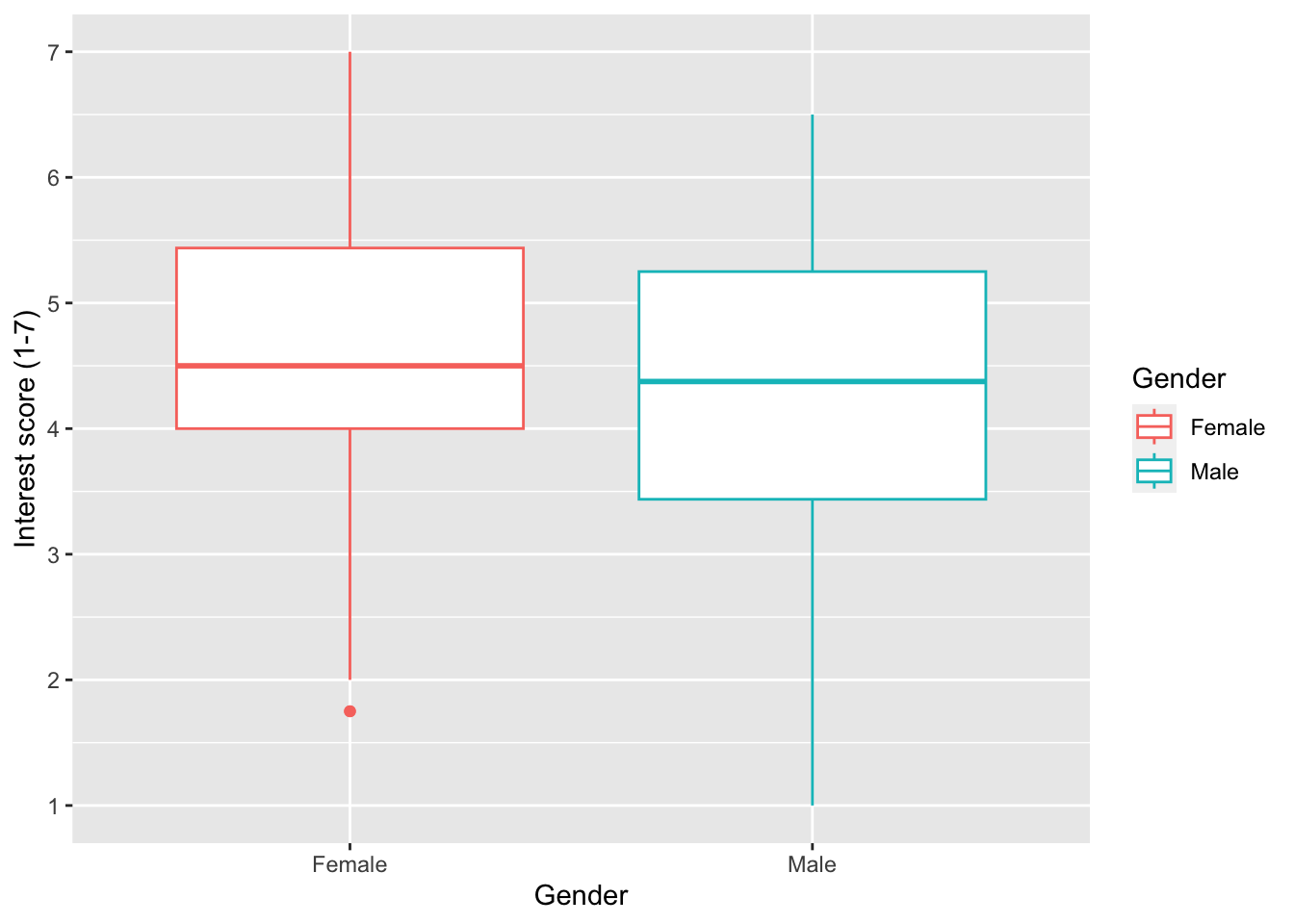
7.3.3 Activity 9 - Controlling colours
scale_fill_discrete() and choosing colours through the type argument (you can do this through character names or choosing a HEX code: https://r-charts.com/colors/).
zhang_data_long %>%
drop_na(Gender) %>%
ggplot(aes(y = Interest, x = Gender, fill = Gender)) +
geom_boxplot() +
scale_y_continuous(name = "Interest score (1-7)",
breaks = c(1:7)) +
scale_fill_discrete(type = c("blue", "pink"))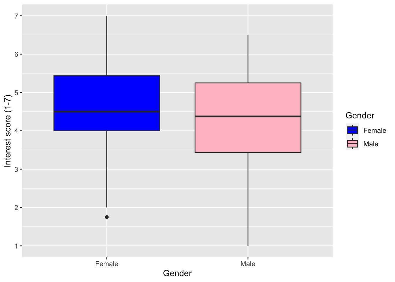
Alternatively (and what we recommend), you can use scale_fill_viridis_d(). This function does exactly the same thing but it uses a colour-blind friendly palette (which also prints in black and white). There are 5 different options for colours and you can see them by changing option to A, B, C, D or E. We like option E with alpha = 0.6 (to control transparency and soften the tone) but play around with the options to see what you prefer.
zhang_data_long %>%
drop_na(Gender) %>%
ggplot(aes(y = Interest, x = Gender, fill = Gender)) +
geom_boxplot() +
scale_y_continuous(name = "Interest score (1-7)",
breaks = c(1:7)) +
scale_fill_viridis_d(option = "E",
alpha = 0.6) +
guides(fill = FALSE)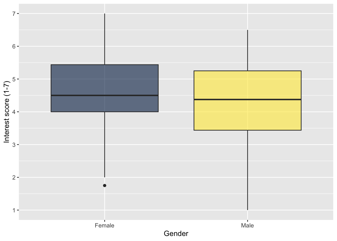
Try this
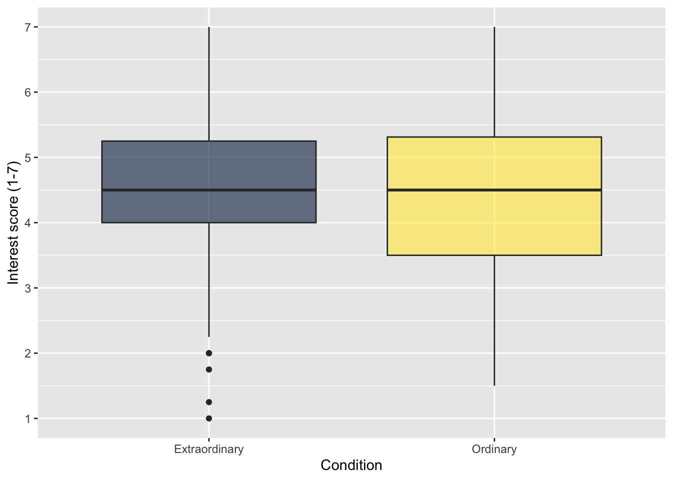
For your independent boxplot, use zhang_data_long to visualise Interest as your continuous variable and Condition for different categories. This will show the difference in interest rating between those in the ordinary and extraordinary groups.
Comparing the ordinary and extraordinary groups, it looks like .
Show me the solution
7.3.4 Activity 10 - Ordering categories
When we plot variables like Gender on the x-axis, R has an internal order it sets unless you create a factor. The default is alphabetical or numerical. In previous plots, it displayed Female then Male, as F comes before M.
Controlling the order of categories is an important design choice to communicate your message, and the most direct way is controlling the factor order before plotting. Here, we add mutate() in a pipe and manually set the factor levels, just be careful as it is case sensitive to the values in your data.
zhang_data_long %>%
drop_na(Gender) %>%
mutate(Gender = factor(Gender,
levels = c("Male", "Female"))) %>%
ggplot(aes(y = Interest, x = Gender, fill = Gender)) +
geom_boxplot() +
scale_y_continuous(name = "Interest score (1-7)",
breaks = c(1:7)) +
scale_fill_viridis_d(option = "E",
alpha = 0.6) +
guides(fill = FALSE)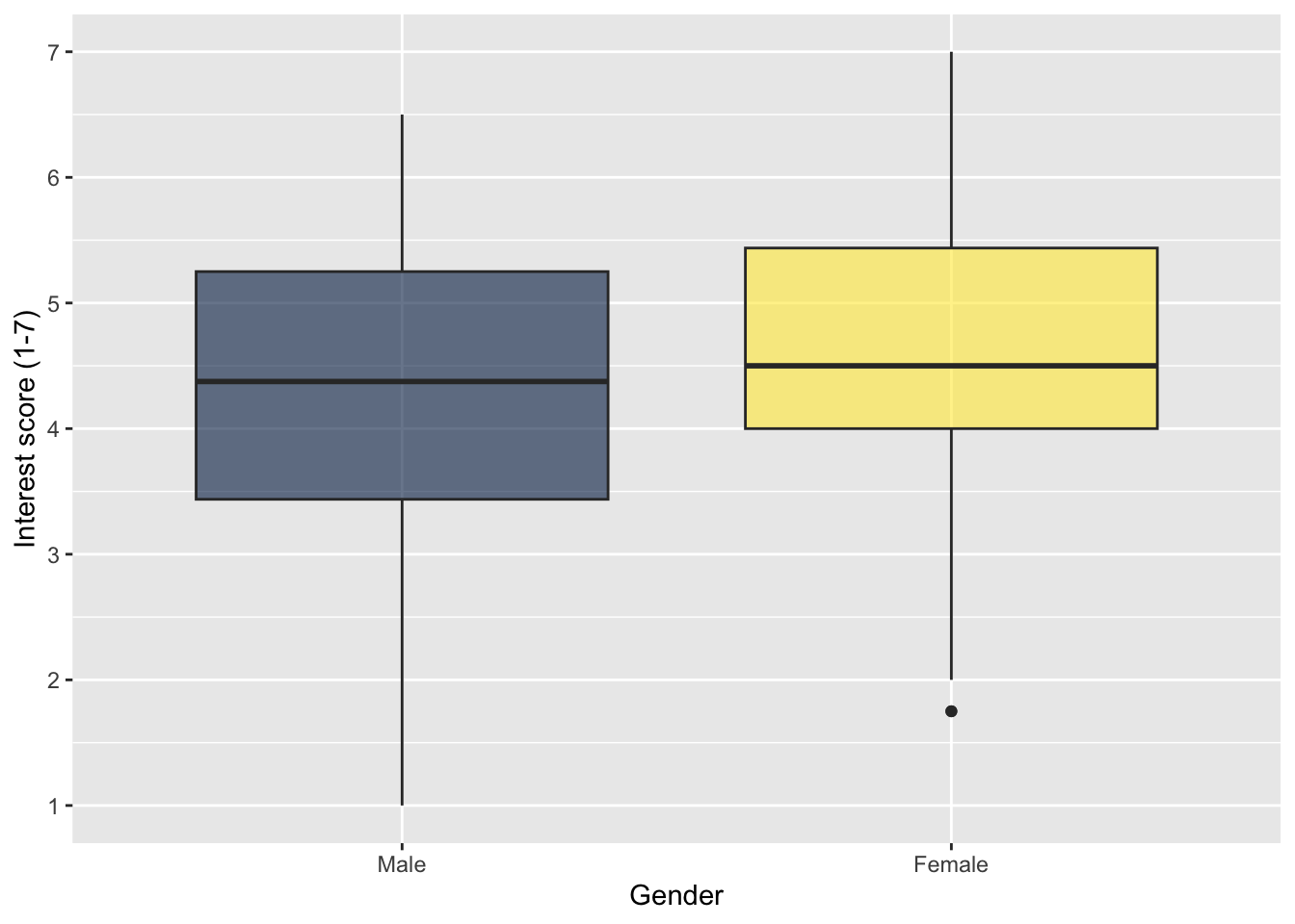
7.3.5 Activity 11- Boxplots for multiple factors
When you only have one independent variable, using the fill argument to change the colour can be a little redundant as the colours do not add any additional information. It makes more sense to use colour to represent a second variable.
For this example, we will use Condition and Time as variables. fill() now specifies a second independent variable, rather than repeating the variable on the x-axis as in the previous plot, so we do not want to deactivate the legend.
zhang_data_long %>%
ggplot(aes(y = Interest, x = Condition, fill = Time)) +
geom_boxplot() +
scale_y_continuous(name = "Interest score (1-7)",
breaks = c(1:7)) +
scale_fill_viridis_d(option = "E",
alpha = 0.6)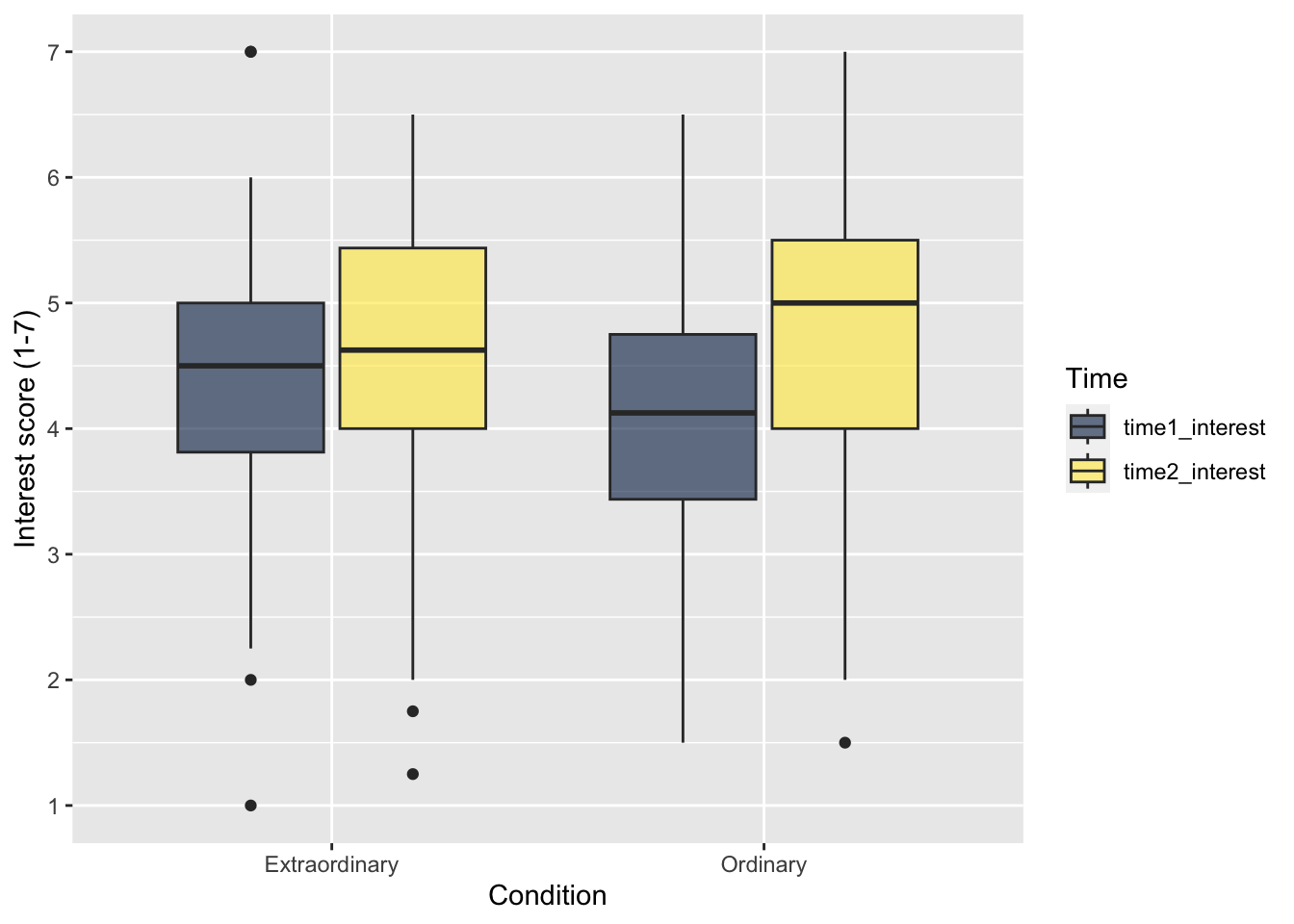
As a final point here, the fill values on the legend are not the most professional looking. Like reordering factors, the easiest way of addressing this is editing the underlying data before piping to
zhang_data_long %>%
mutate(Time = case_match(Time,
"time1_interest" ~ "Time 1",
"time2_interest" ~ "Time 2")) %>%
ggplot(aes(y = Interest, x = Condition, fill = Time)) +
geom_boxplot() +
scale_y_continuous(name = "Interest score (1-7)",
breaks = c(1:7)) +
scale_fill_viridis_d(option = "E",
alpha = 0.6)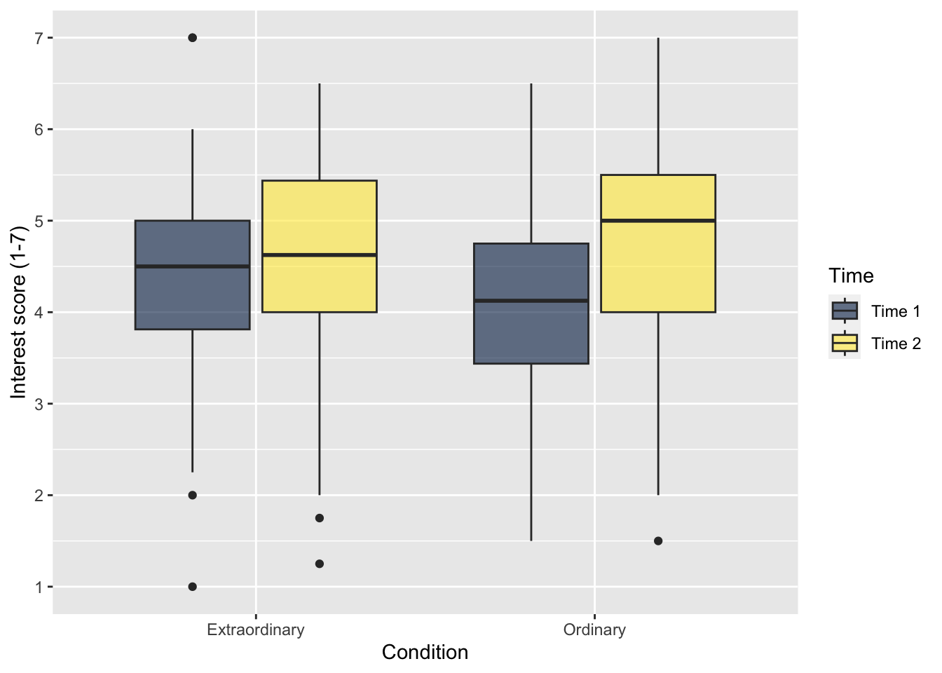
7.4 Violin-boxplots
Boxplots are great for your own exploratory data analysis but you do not often see them reported in isolation. They visualise summary statistics, but you do not get much sense of the underlying distribution of values. When you want to communicate continuous outcomes, researchers in psychology are using violin-boxplots more often. This combines both elements: a violin plot to show the distribution of the data, and a boxplot to add summary statistics. This is where
7.4.1 Activity 12 - Creating a basic violin plot
Violin plots get their name as they look something like a violin when the data are roughly normally distributed. They show density, so the fatter the violin element, the more data points there are for that value. Compared to the boxplot, the only difference is changing the layer to geom_violin().
zhang_data_long %>%
drop_na(Gender) %>%
ggplot(aes(y = Interest, x = Gender)) +
geom_violin() +
scale_y_continuous(name = "Interest score (1-7)",
breaks = c(1:7))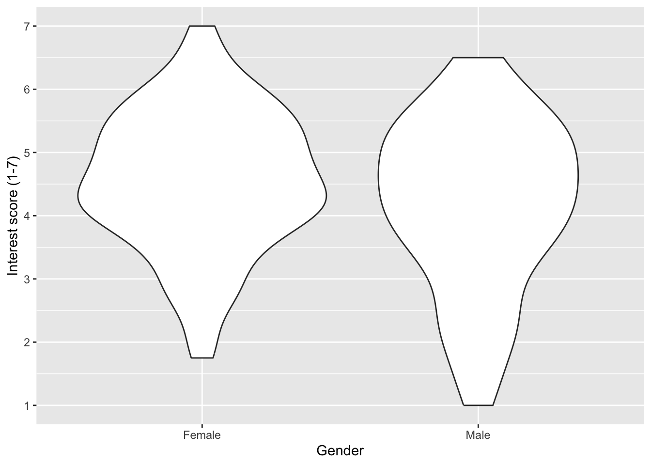
The distribution of values is great, but sometimes it might be useful to also add the underlying data points. These are all important design choices as it can be useful when you have smaller amounts of data, but overwhelming when you have thousands of data points. So, keep in mind what you want to communicate. Here, we use the layer geom_jitter() to jitter the points slightly, so they are not all in a vertical line and we get a better sense of the density.
zhang_data_long %>%
drop_na(Gender) %>%
ggplot(aes(y = Interest, x = Gender)) +
geom_violin() +
geom_jitter(height = 0, # do not jitter height
width = .1) + # jitter width of points
scale_y_continuous(name = "Interest score (1-7)",
breaks = c(1:7))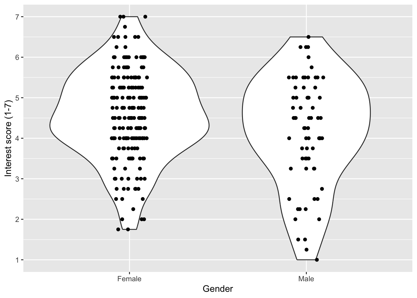
Important
It is important to remember that R is very literal. geom_jitter() first and then add geom_violin(). The order of your layers matters.
7.4.2 Activity 13 - Creating a violin-boxplot
Instead of adding the data points in a layer, we can add a boxplot to create the violin-boxplot. This way, we get distribution information from the violin layer and summary statistics from the boxplot layer.
zhang_data_long %>%
drop_na(Gender) %>%
ggplot(aes(y = Interest, x = Gender)) +
geom_violin() +
geom_boxplot() +
scale_y_continuous(name = "Interest score (1-7)",
breaks = c(1:7))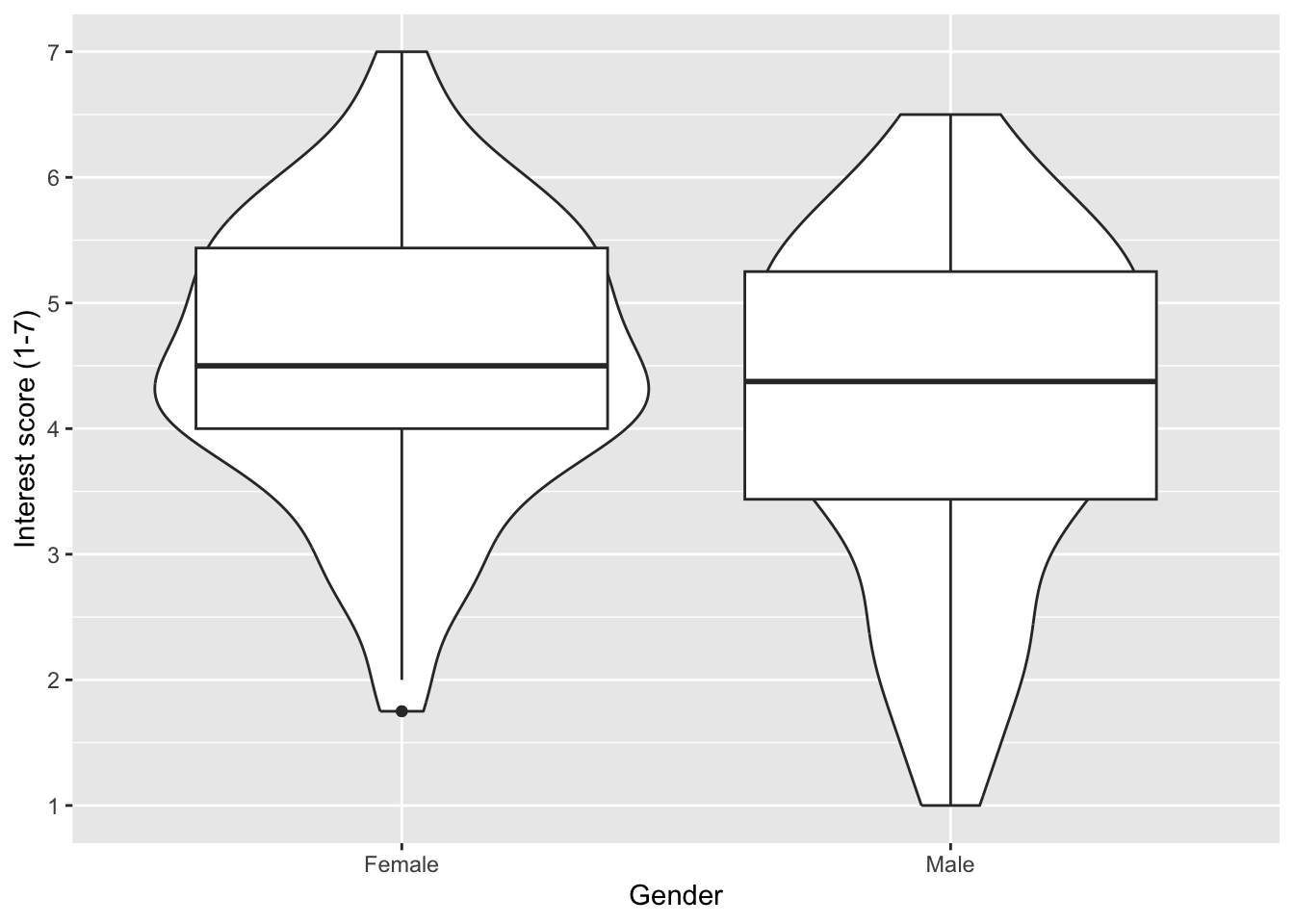
On it’s own, this does not look great. We can edit the settings to reduce the width of the boxplots, add a colour scheme, and add transparency to the violin layer to make it easier to see the boxplot.
zhang_data_long %>%
drop_na(Gender) %>%
ggplot(aes(y = Interest, x = Gender, fill = Gender)) +
geom_violin(alpha = 0.5) +
geom_boxplot(width = 0.2) +
scale_fill_viridis_d(option = "E") +
scale_y_continuous(name = "Interest score (1-7)",
breaks = c(1:7)) +
guides(fill = FALSE)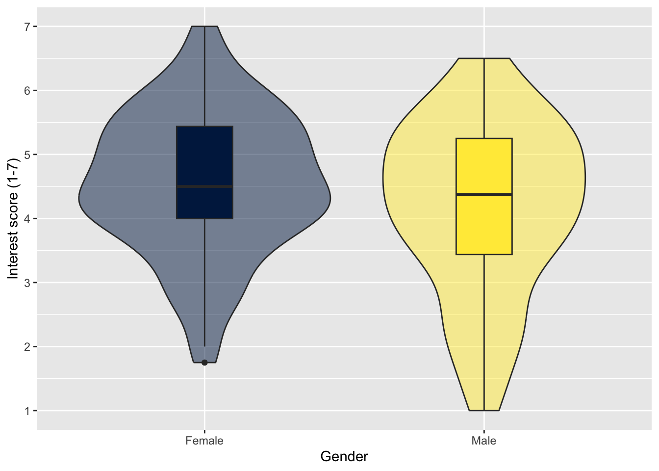
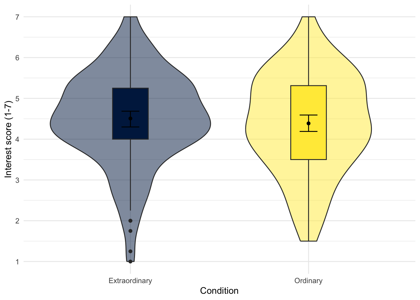
The boxplot uses the median for the centre line, but in your report you might be presenting means per category which will be slightly different. One further variation is removing the centre median line, and replacing it with the mean and 95% confidence interval (more on that in the lectures and Chapter 8). This way, you get three layers: the violin plot for the density, the boxplot for distribution summary statistics, and the mean and 95% confidence interval.
This code uses two calls to stat_summary() which is a layer to add summary statistics. The first layer draws a point to represent the mean, and the second draws an errorbar that represents the 95% confidence interval around the mean.
zhang_data_long %>%
drop_na(Gender) %>%
ggplot(aes(y = Interest, x = Gender, fill = Gender)) +
geom_violin(alpha = 0.5) +
geom_boxplot(width = 0.2,
fatten = NULL) +
stat_summary(fun = "mean",
geom = "point") +
stat_summary(fun.data = "mean_cl_boot", # confidence interval
geom = "errorbar",
width = 0.1) +
scale_fill_viridis_d(option = "E") +
scale_y_continuous(name = "Interest score (1-7)",
breaks = c(1:7)) +
guides(fill = FALSE)
Warning
When you run the line stat_summary(fun.data = "mean_cl_boot", geom = "errorbar", width = .1) for the first time, you might be prompted to install the R package
Try this
For your independent violin-boxplot, use zhang_data_long to visualise Interest as your continuous variable and Condition for different categories on the x-axis. Try and create the plot to look like this, so you might need to play around with different themes:
Show me the solution
You should have the following in a code chunk:
zhang_data_long %>%
ggplot(aes(y = Interest, x = Condition, fill = Condition)) +
geom_violin(alpha = 0.5) +
geom_boxplot(width = 0.2,
fatten = NULL) +
stat_summary(fun = "mean",
geom = "point") +
stat_summary(fun.data = "mean_cl_boot",
geom = "errorbar",
width = .1) +
scale_fill_viridis_d(option = "E") +
scale_y_continuous(name = "Interest score (1-7)",
breaks = c(1:7)) +
theme_minimal() +
guides(fill = FALSE)7.4.3 Activity 14 - Adding additional variables
Like boxplots, we can add a second grouping variable to fill instead of just using it for colour.
zhang_data_long %>%
ggplot(aes(y = Interest, x = Condition, fill = Time)) +
geom_violin(alpha = 0.5) +
geom_boxplot(width = 0.2,
fatten = NULL) +
stat_summary(fun = "mean",
geom = "point") +
stat_summary(fun.data = "mean_cl_boot",
geom = "errorbar",
width = .1) +
scale_fill_viridis_d(option = "E") +
scale_y_continuous(name = "Interest score (1-7)",
breaks = c(1:7)) +
theme_minimal()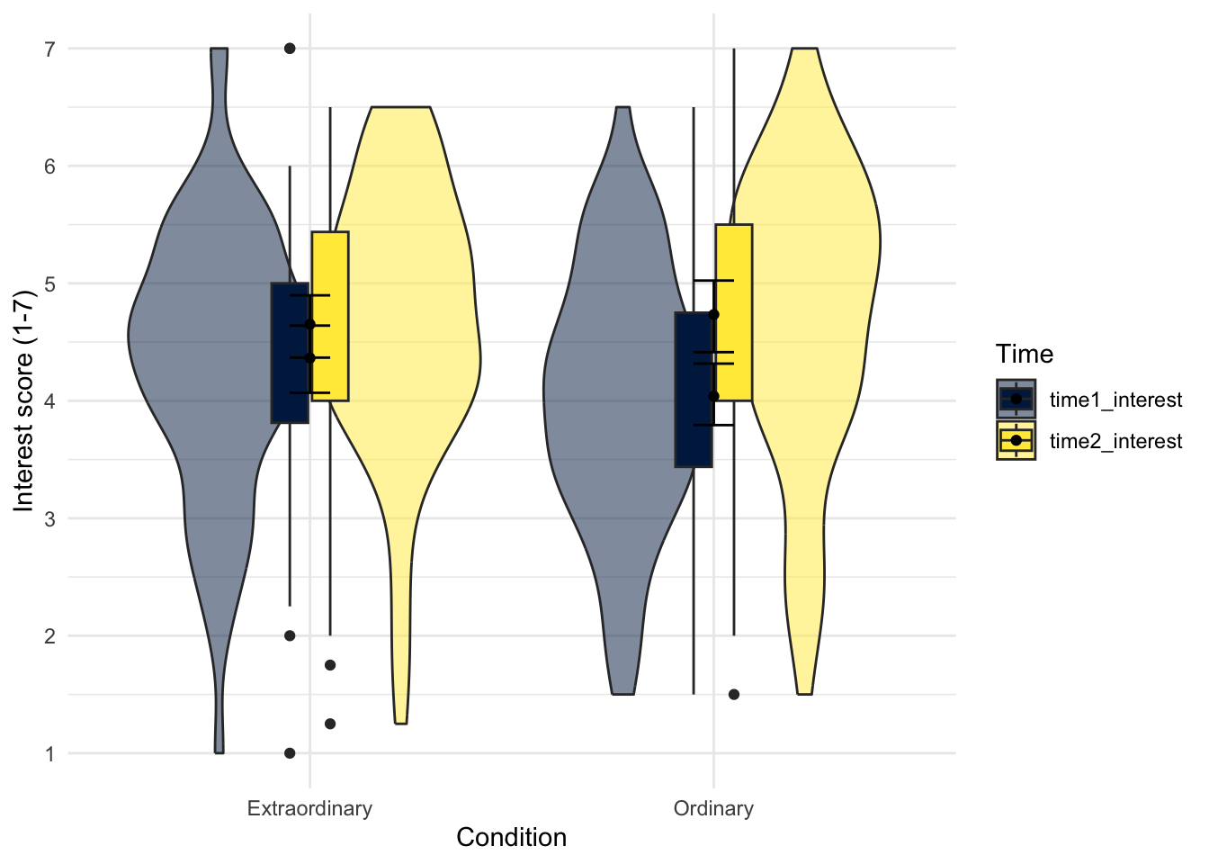
However, unless you are trying to recreate a Kandinsky painting in
# specify as an object, so we only change it in one place
dodge_value <- 0.9
zhang_data_long %>%
ggplot(aes(y = Interest, x = Condition, fill = Time)) +
geom_violin(alpha = 0.5) +
geom_boxplot(width = 0.2,
fatten = NULL,
position = position_dodge(dodge_value)) +
stat_summary(fun = "mean",
geom = "point",
position = position_dodge(dodge_value)) +
stat_summary(fun.data = "mean_cl_boot",
geom = "errorbar",
width = .1,
position = position_dodge(dodge_value)) +
scale_fill_viridis_d(option = "E") +
scale_y_continuous(name = "Interest score (1-7)",
breaks = c(1:7))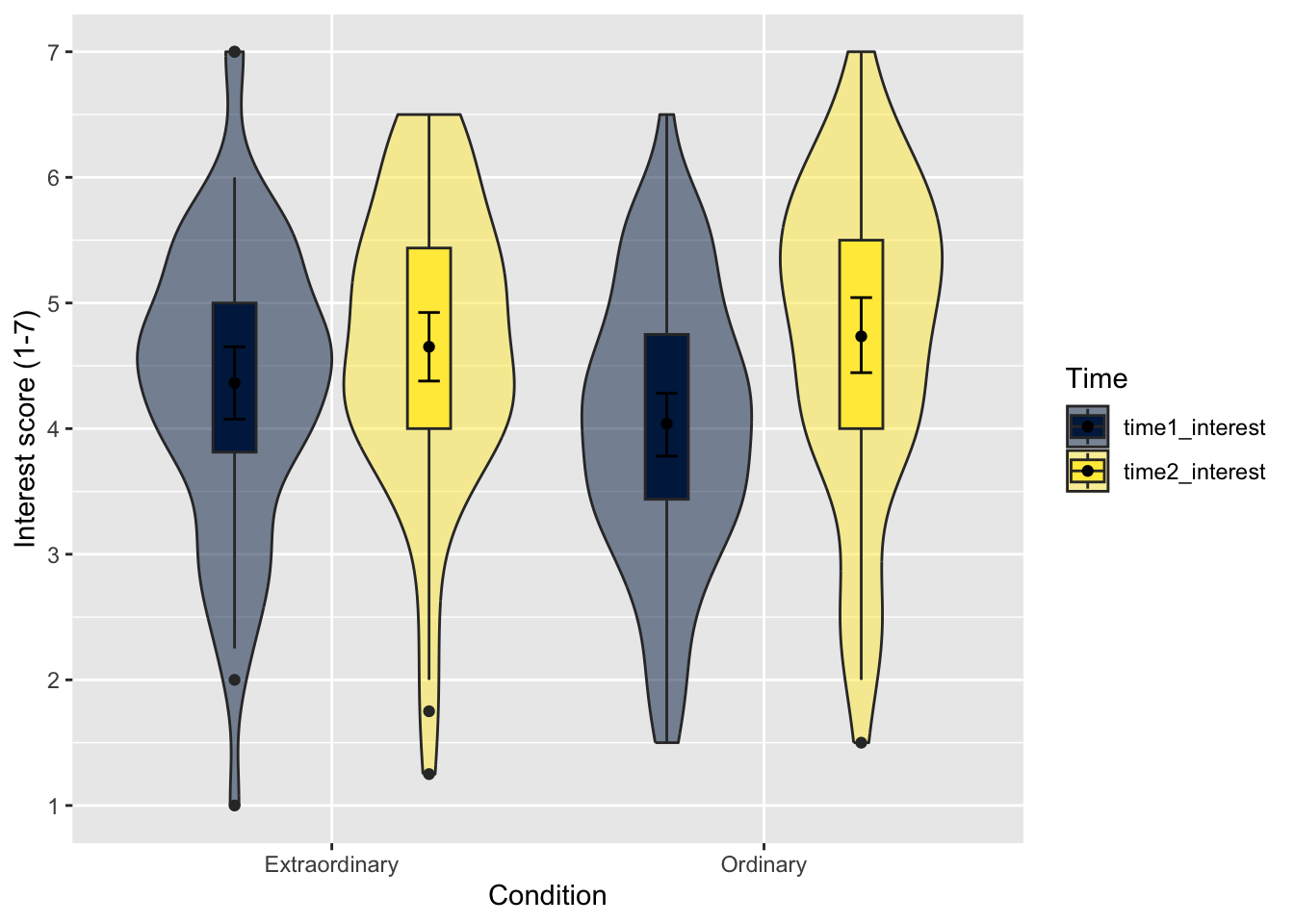
This looks much better! Remember, if you want to change the legend labels, the easiest way is recoding the data before piping to
Finally, we might want to add a third variable to group the data by. There is a facet function that produces different plots for each level of a grouping variable which can be very useful when you have more than two factors. The following code shows interest ratings for all three variables we have worked with: Condition, Time, and Gender.
# specify as an object, so we only change it in one place
dodge_value <- 0.9
zhang_data_long %>%
drop_na(Gender) %>%
ggplot(aes(y = Interest, x = Condition, fill = Time)) +
geom_violin(alpha = 0.5) +
geom_boxplot(width = 0.2,
fatten = NULL,
position = position_dodge(dodge_value)) +
stat_summary(fun = "mean",
geom = "point",
position = position_dodge(dodge_value)) +
stat_summary(fun.data = "mean_cl_boot",
geom = "errorbar",
width = .1,
position = position_dodge(dodge_value)) +
facet_wrap(~ Gender) + # facet by Gender
scale_fill_viridis_d(option = "E") +
scale_y_continuous(name = "Interest score (1-7)",
breaks = c(1:7))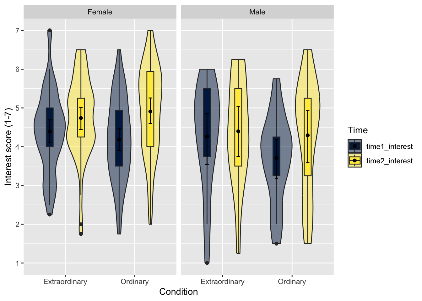
Facets work in the same way as adding a variable to fill. It is not easy to change the labels within
7.5 Test yourself
To end the chapter, we have some knowledge check questions to test your understanding of the concepts we covered in the chapter. We then have some error mode tasks to see if you can find the solution to some common errors in the concepts we covered in this chapter.
7.5.1 Knowledge check
Question 1. You want to plot several summary statistics including the median for your outcome, which
Question 2. You want to create a scatterplot to show the correlation between two continuous variables, which
Question 3. You want to show the density of values in your outcome, which
Question 4. To separate a scatterplot into different groups, you could specify a grouping variable using the fill argument to change the colour of the points?
Explain this answer
This was a sneaky one, but relates to the error mode warning within the chapter. There are two ways to add a grouping variable for separate colours: colour and fill. In this scenario, colour would change the colour of the points, whereas fill would only change the colour of the regression line and its 95% confidence interval ribbon. Sometimes you need to play around with the settings to produce the effects you want.
Question 5. The order of layers is important in
Explain this answer
In addition to the layer order, we also added an error mode feature to recognise when you need to use the pipe %>% vs the +.
data %>% ggplot() + geom_boxplot() + geom_jitter()was the correct answer as we add data point after the boxplot.data + ggplot() + geom_boxplot() + geom_jitter()had the right order, but we used+instead of the pipe between the data and the initialggplot()function.data + ggplot() + geom_jitter() + geom_boxplot()anddata %>% ggplot() + geom_jitter() + geom_boxplot()both had the wrong layer order as the boxplot would overlay the points.
7.5.2 Error mode
The following questions are designed to introduce you to making and fixing errors. For this topic, we focus on the new types of data visualisation. Remember to keep a note of what kind of error messages you receive and how you fixed them, so you have a bank of solutions when you tackle errors independently.
Create and save a new R Markdown file for these activities. Delete the example code, so your file is blank from line 10. Create a new code chunk to load
# Load the tidyverse package below
library(tidyverse)
# Load the data file
# This should be the Zhang_2014.csv file
zhang_data <- read_csv("data/Zhang_2014.csv")
# Wrangle the data for plotting.
# select and rename key variables
# mutate to add participant ID and recode
zhang_data <- zhang_data %>%
select(Gender,
Age,
Condition,
time1_interest = T1_Predicted_Interest_Composite,
time2_interest = T2_Actual_Interest_Composite) %>%
mutate(participant_ID = row_number(),
Condition = case_match(Condition,
1 ~ "Ordinary",
2 ~ "Extraordinary"),
Gender = case_match(Gender,
1 ~ "Male",
2 ~ "Female"))
# gather the data to convert to long format
zhang_data_long <- zhang_data %>%
  pivot_longer(cols = time1_interest:time2_interest,
               names_to = "Time",
values_to = "Interest")Below, we have several variations of a code chunk error or misspecification. Copy and paste them into your R Markdown file below the code chunk to load
Question 6. Copy the following code chunk into your R Markdown file and press knit. This code… works, but it does not look quite right? Why are the tick marks not displaying properly?
```{r}
zhang_data %>%
ggplot(aes(x = time1_interest, y = time2_interest)) +
geom_point() +
theme_classic() +
scale_x_discrete(name = "Time 1 interest score (1-7)",
breaks = c(1:7)) + # tick marks from 1 to 7
scale_y_discrete(name = "Time 2 interest score (1-7)",
breaks = c(1:7)) + # tick marks from 1 to 7
geom_smooth(method = "lm")
```
Explain the solution
In this example, we used the wrong function for continuous variables. We used scale_x_discrete and scale_y_discrete, instead of scale_x_continuous and scale_y_continuous. We must honour the variable type when we customise the plot, so think about what type of variable is on each axis and which function lets you edit it.
zhang_data %>%
ggplot(aes(x = time1_interest, y = time2_interest)) +
geom_point() +
theme_classic() +
scale_x_continuous(name = "Time 1 interest score (1-7)",
breaks = c(1:7)) + # tick marks from 1 to 7
scale_y_continuous(name = "Time 2 interest score (1-7)",
breaks = c(1:7)) + # tick marks from 1 to 7
geom_smooth(method = "lm")Question 7. Copy the following code chunk into your R Markdown file and press knit. You should receive an error like Error in "fortify()":! "data" must be a <data.frame>, or an object coercible by "fortify()" which is a little cryptic.
```{r}
zhang_data_long +
ggplot(aes(y = Interest, x = Condition, fill = Condition)) +
geom_boxplot() +
scale_y_continuous(name = "Interest score (1-7)",
breaks = c(1:7)) +
scale_fill_viridis_d(option = "E",
alpha = 0.6) +
guides(fill = FALSE)
```
Explain the solution
Once we start using a mixture of %>% between layers, and which uses +. Here, we tried using the + between the data object and the initial ggplot() layer. We need a pipe here or it thinks you are trying to set the data argument using aes().
Question 8. Copy the following code chunk into your R Markdown file and press knit. We want to change the order of the categories to present males then female. This code…works, but is it doing what we think it is doing?
```{r}
zhang_data_long %>%
  drop_na(Gender) %>%
  ggplot(aes(y = Interest, x = Gender)) +
  geom_violin() +
  scale_y_continuous(name = "Interest score (1-7)",
breaks = c(1:7)) +
scale_x_discrete(labels = c("Male", "Female"))
```
Explain the solution
We have introduced this error several times, but we see it so often it is worth reinforcing. When we change the labels, this is really just to tidy things up. The underlying data does not change, we are just trying to communicate it clearer. If we want to change the order of categories, we must change the underlying order of the data as a factor or R will default to alphabetical/numerical. So, we mutate Gender as a factorm, then pipe to
7.6 Words from this Chapter
Below you will find a list of words that were used in this chapter that might be new to you in case it helps to have somewhere to refer back to what they mean. The links in this table take you to the entry for the words in the PsyTeachR Glossary. Note that the Glossary is written by numerous members of the team and as such may use slightly different terminology from that shown in the chapter.
| term | definition |
|---|---|
| boxplot | Visualising a continuous variable by five summary statistics: the median centre line, the first and third quartile, and 1.5 times the first and third quartiles. |
| scatterplot | Plotting two variables on the x- and y-axis to show the correlation/relationship between the variables. |
| violin-boxplots | A combination of a violin plot to show the density of data points and a boxplot to show summary statistics of distribution. |
7.7 End of chapter
Well done, you have completed the second chapter dedicated to data visualisation! This is a key area for psychology research and helping to communicate your findings to your audience. Data visualisation also comes with a lot of responsibility. There are lots of design choices to make and help communicate your findings as effectively and transparently as possible. We could dedicate a whole book to data visualisation possibilities in R and
In the next chapter, we start on inferential statistics introducing you to the concept of regression by focusing on one continuous predictor variable.